Concepts On Stilts are a web based architectural drafting service. To accompany the launch of their new website, they wanted a new mark that simplified their identity and better communicated their personality. I suggested a clean logo using a modern font would be a starting point and the client was happy for me to proceed.
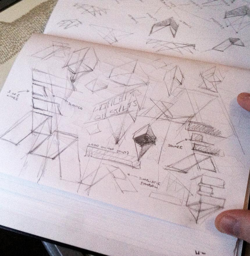
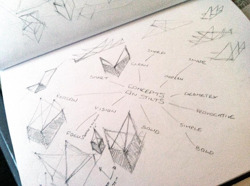
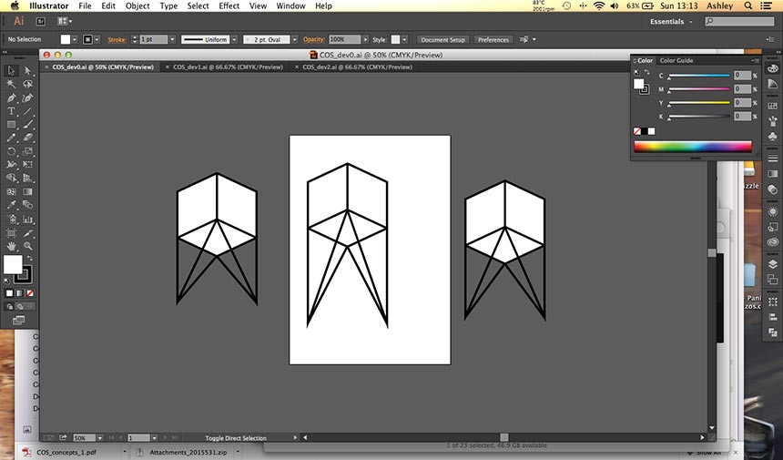
My early sketches focused on the idea of a simple structure becoming the icon. Ideas like architectural support struts and stilts arranged into geometric patterns were a possible route for me at this stage. I had to remain conscious of the design becoming overly complicated because this would contradict what the client was trying to say with the mark. During the sketching process I always try to keep an open mind, looking beyond the rough pencil lines and doing my best to visualise the finished mark.
Sketches of a cube represented the ‘concept’ and the block colour surface was added to make it solid, give it weight. The ‘Concept’ has depth. Even though I liked the idea of having this icon separate from the title, their still seemed to be a better way to solve the problem.
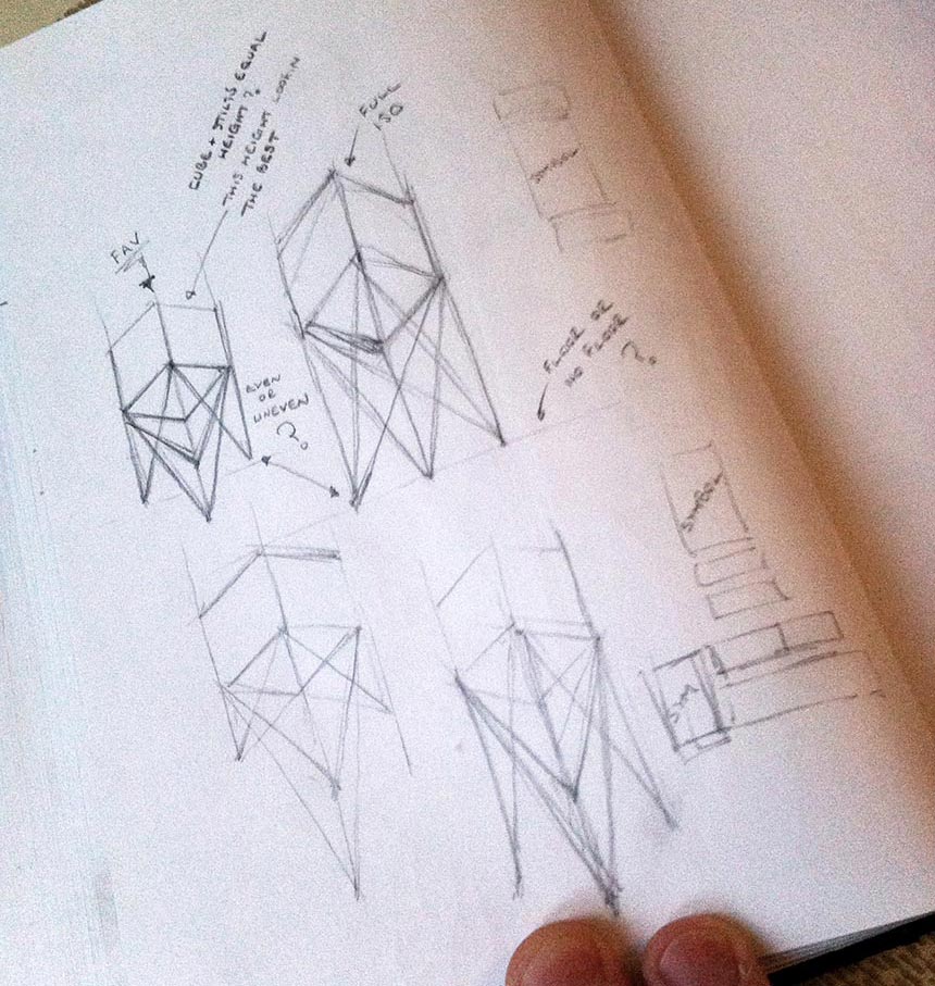
After experimenting with the proportions of this design I moved into Illustrator to develop it as a vector. For me, recreating the design as a vector is make or break. I get a better idea of what may or may not work well and sometimes sketched designs fall flat on their face at this point. Early versions showed some promise.
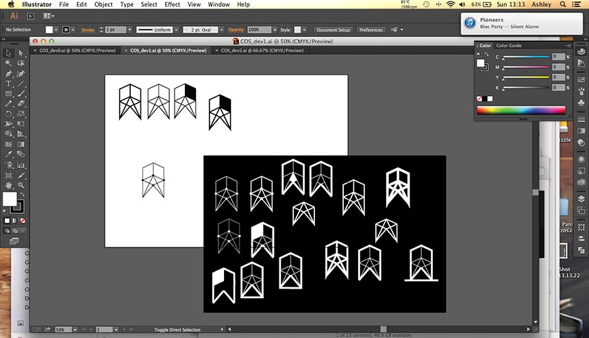
Stroke weight and fill were things that I knew may help inject some meaning into the design. Iterating through many versions is a crucial process for me at this stage, sometimes even resulting in a new idea that moves in a totally new direction.
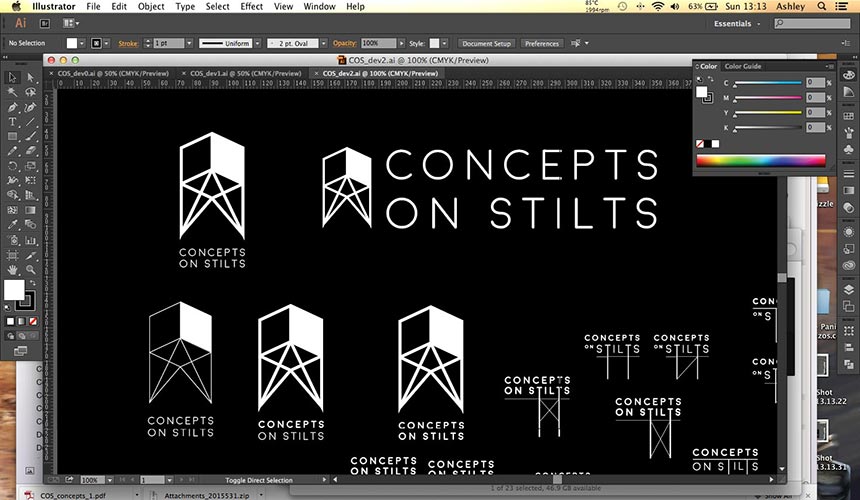
Generally I would spend a lot of time looking into a suitable font and how that font could possibly be customised, before making a decision. Not in this case, Moon typeface was a perfect fit. Modern, clean and geometric, the font ticked all the boxes and I really liked the way it complemented the icon I was developing.
At this point I had an idea, what if I drop the icon and try building the structure into the title itself. Heading off in this new direction I began to develop a title that hinted at the subject matter without the aid of a separate icon. If I could find something that worked, this would simplify the design the world over. The typeface’s simplicity made it very easy for me to add and remove elements that looked like they belonged in the composition.
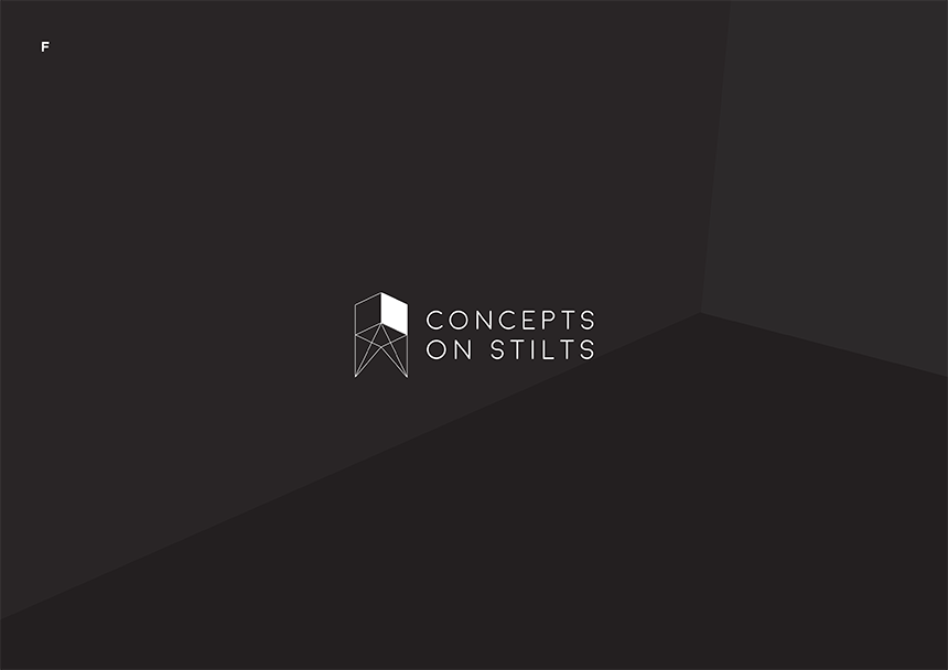
I presented a selection of concepts to the client, designs that I thought fit the brief and solved the problem. Below are two of the six designs I submitted, but in the end were not chosen.
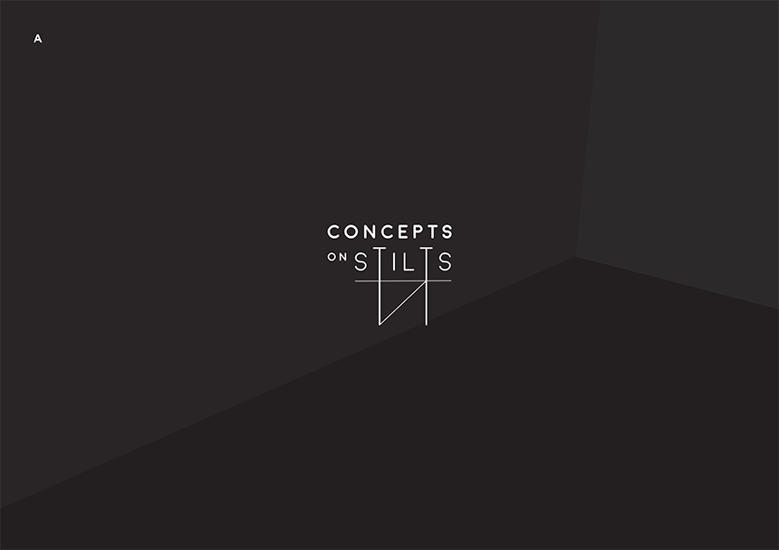
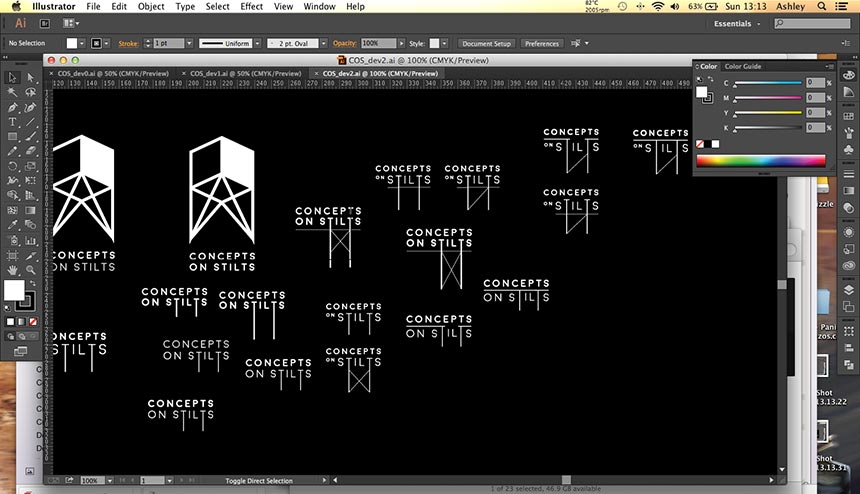
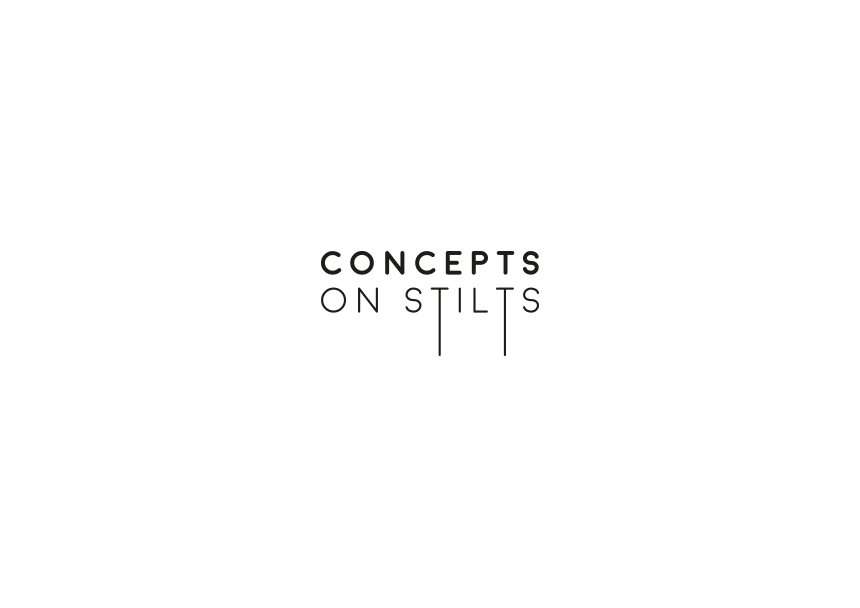
We agreed that, out of the six designs I proposed, the design below did the job in the simplest way possible. I used the Ts in the word stilts, to turn the title into a structure supported by struts. The client liked the overall clean aesthetic of the mark and we both agreed that it reflected the personality of the company it was to represent. It’s simplicity would translate well across any branded collateral they may use in the future.
Overall, the process of creating this logo was enjoyable. The client had an open mind about what their new mark could be, meaning I could experiment freely without any predetermined rules or guides. The clients satisfaction with the result has helped me gauge the success of the project and with another logo design under my belt I am certainly learning something new about the process each time.