Drop The Mic, a presentation coaching startup, commissioned me to design a logo that communicated their fresh, comedy driven approach.
As always, I began by asking the client a series of questions, an extremely helpful process I picked up from an awesome book called LogoDesignLove. I use the client’s answers to pull together a rough list of possible focus points which I can then develop using mind maps.
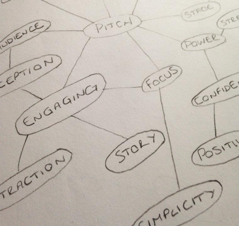
It’s all too easy to pick up the pencil, stare at a blank page and begin to question your ability as a Designer. For me, this has been particularly the case with logo design. I find that if I follow this mind mapping process, before I know it, I’ve gathered momentum, creating links between relevant words and possible forms.
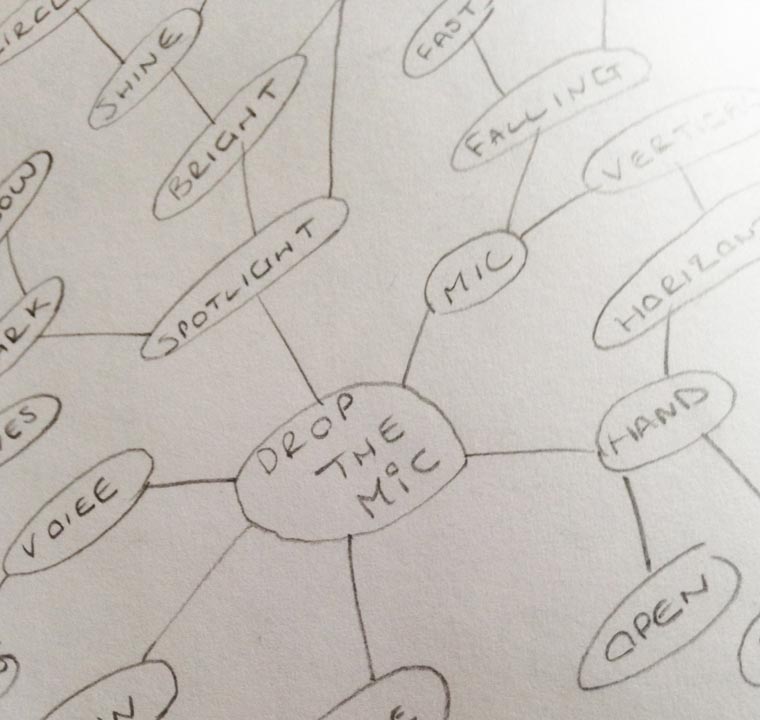
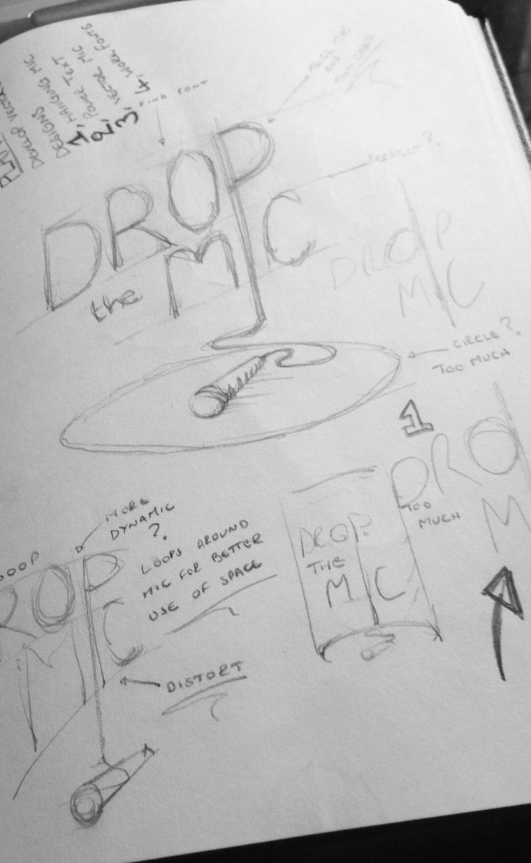
I began sketching using any forms that I think will lend themselves well to a logo mark. With this project there was no shortage of places to start. Of course, a hand dropping a microphone comes to mind, but the mind mapping process had given me new routes, including the idea of focus and a spotlight.
At this point I have no idea what may or may not work, but with more routes to develop, the bigger the possibility I’ll stumble across something that works well.
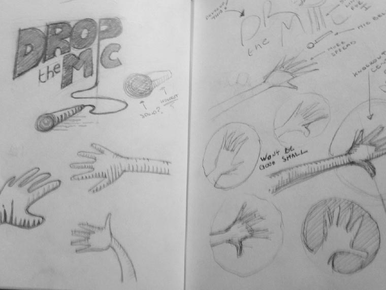
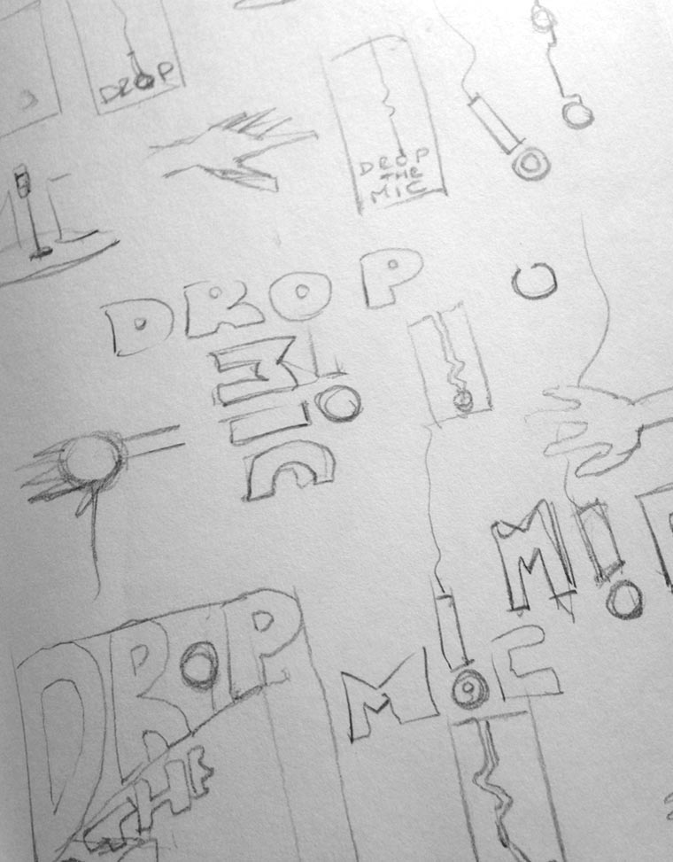
I’ll fill page after page with small thumbnail sketches. I’ll settle for a minimum of fifty, while actually aiming for over a hundred. Basically, I’ll keep sketching my thoughts until they’re pretty much exhausted. I’ve come to understand the value of taking my sweet time at this stage of a project. For Drop the Mic I spent around a week, dropping in and out of my sketchbook. Again, I have to give credit to LogoDesignLove for teaching me to be patient with my ideation. Like I said earlier, not all concepts will work well and some may turn out to be downright terrible, but this is simply exploration and discovery and it should be fun.
With a handful of strong possible routes, I jumped into Illustrator to develop them further. This is another point in my process where certain concepts will fall by the wayside. Keeping momentum is crucial for me, so I work fast and create rough designs. I can always refine later.
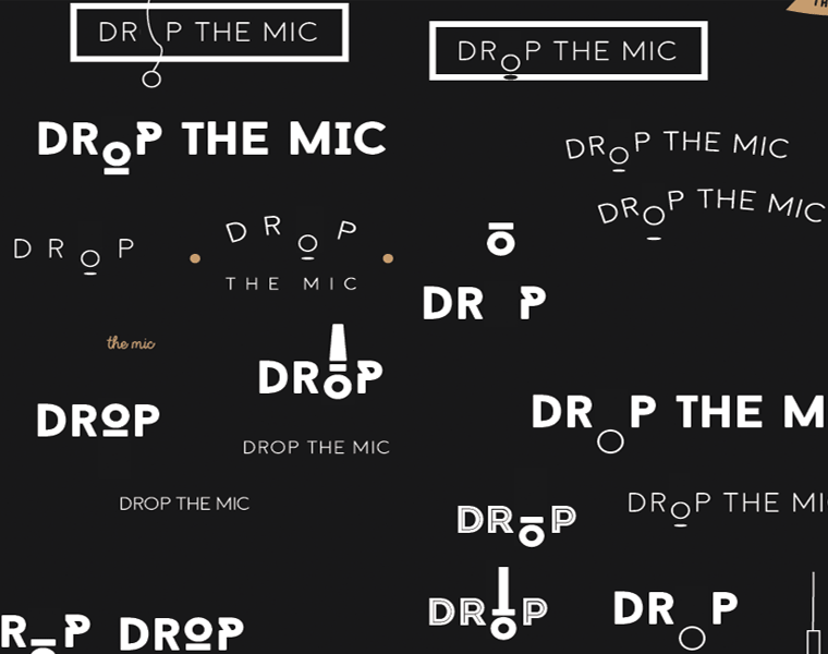
Experimenting with fonts is important and I worked through a wide range for this project. Bold, light, serif, san-serif, script… nothing was off the table. I knew the client wanted something clean, but this can be achieved with any font style as long as your careful. If something takes my fancy I’ll stick with it, tweaking the details, constantly reminding myself not to get hung up on the finish. The concept isn’t going anywhere and I’ll be revisiting at some point.
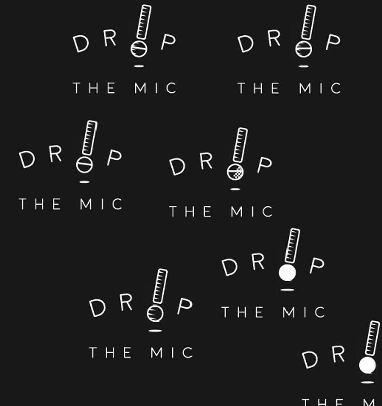
My aim is to end up with a selection of ideas that I feel are strong, even if I may not have the details down. It helps to take these ideas out and place them onto their own art board. The space really helps me to weed out weaker concepts.
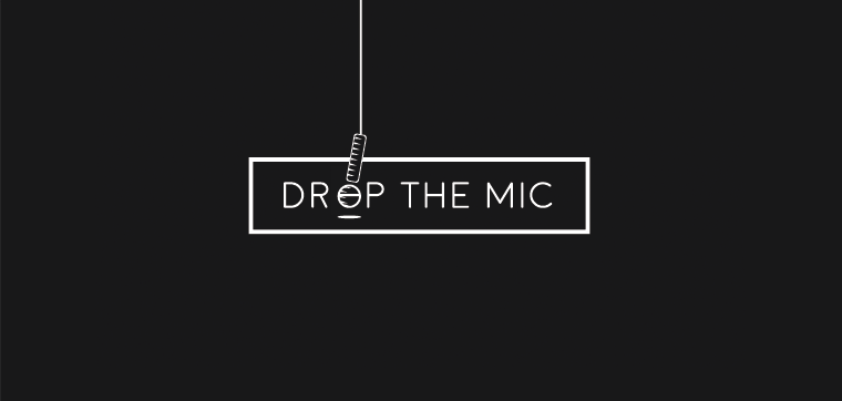
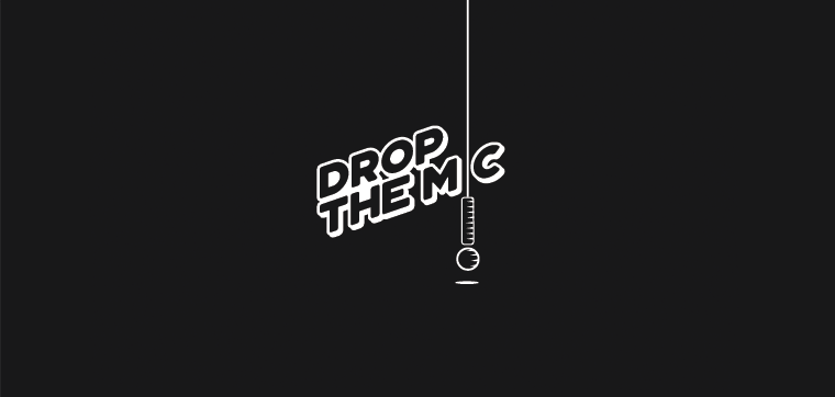
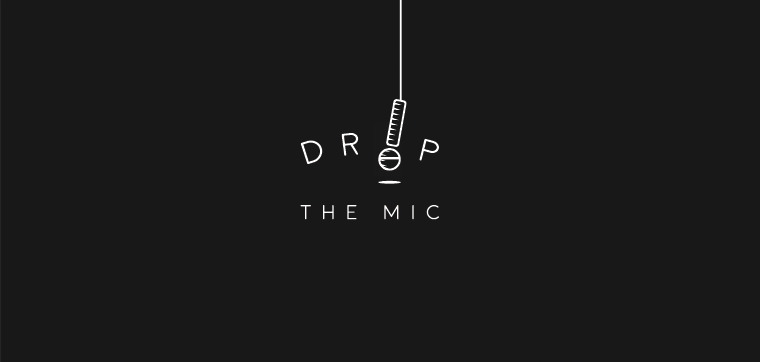
I presented three concepts to the client and a decision was made quickly. This was my cue to begin really fine tuning the design. This involved cleaning up the vector drawing and converting it to a compound shape, ready to be handed over.
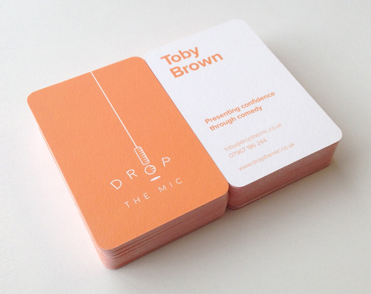
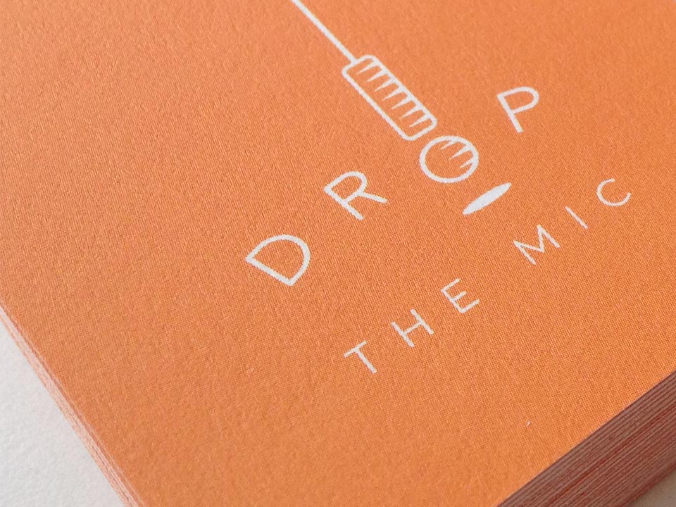
The client was extremely happy with the final product. The business card design shows how the microphone’s cable can extend to the bounds of whatever document the logo is applied to. I used Moo.com for printing and between the rounded corners, coloured edges, and heavy paper stock, the finish was great.