Inspired by amazing pieces of content like The Guardian’s NSA Files and The New York Times’ Tomato Can Blues, I try and shoehorn the idea of visual storytelling into any suitable Huff Post brand partnership brief that comes my way.
As part of a larger partnership with Freeview, this example was our first, albeit very simple, attempt at this. You can check it out, minus the Freeview wallpaper and ad units, here.
Without a doubt, a project like this needs a certain type of approach and planning. It’s clear that the editor should work closely with the designer so that content is written and visuals are designed in tandem. Did we do this? Nope. In this case the content was already written and it was apparent to all that it was dry as f*@k. My job was to improve upon the planned, static images, in the hope that we could make the piece a little more engaging.
Despite my initial expectations around it’s simplicity, Huff Post’s content management system turned this into a challenge. All HTML, CSS and Javascript had to be written within the CMS editor. To create the animations I used a plugin called Skrollr, but without the ability to upload this to a secure server, I had to load this to the page dynamically.
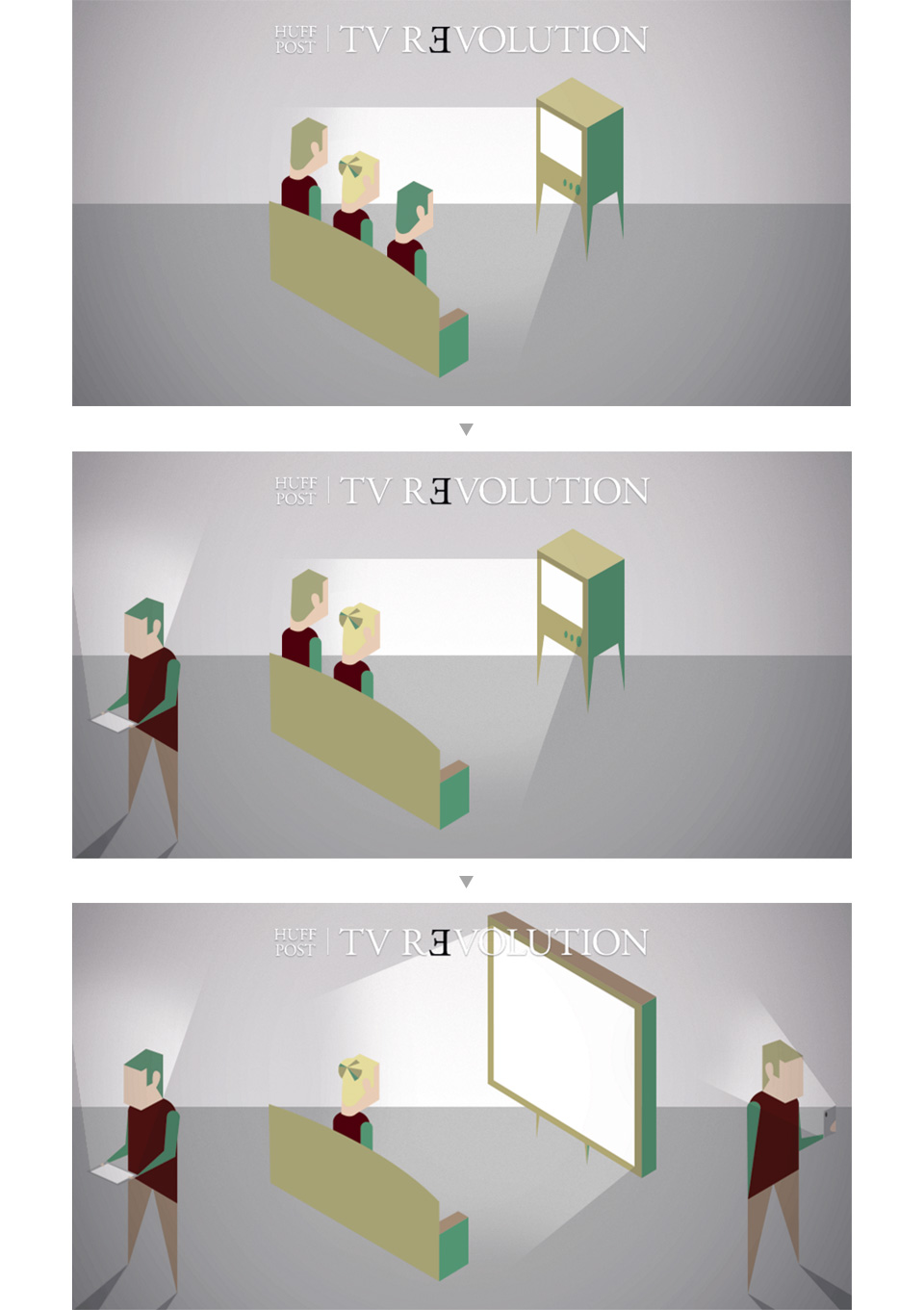
All illustration was done by yours truly following an isometric style, the main reason being, the deadline was tight and I new this would be a suitably quick way of achieving the scenes I wanted. Scene one illustrates the evolving way we consume television.

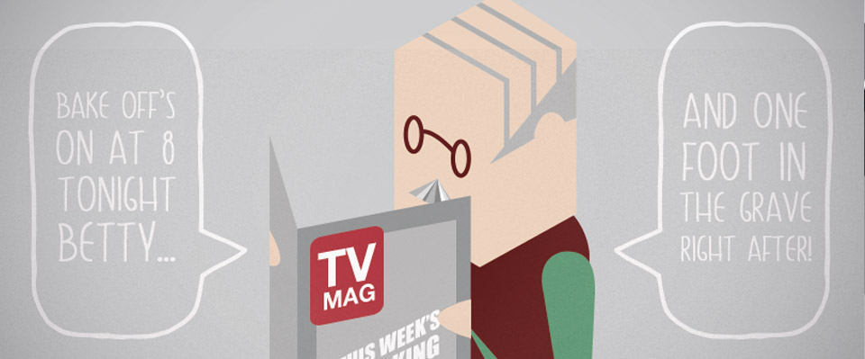
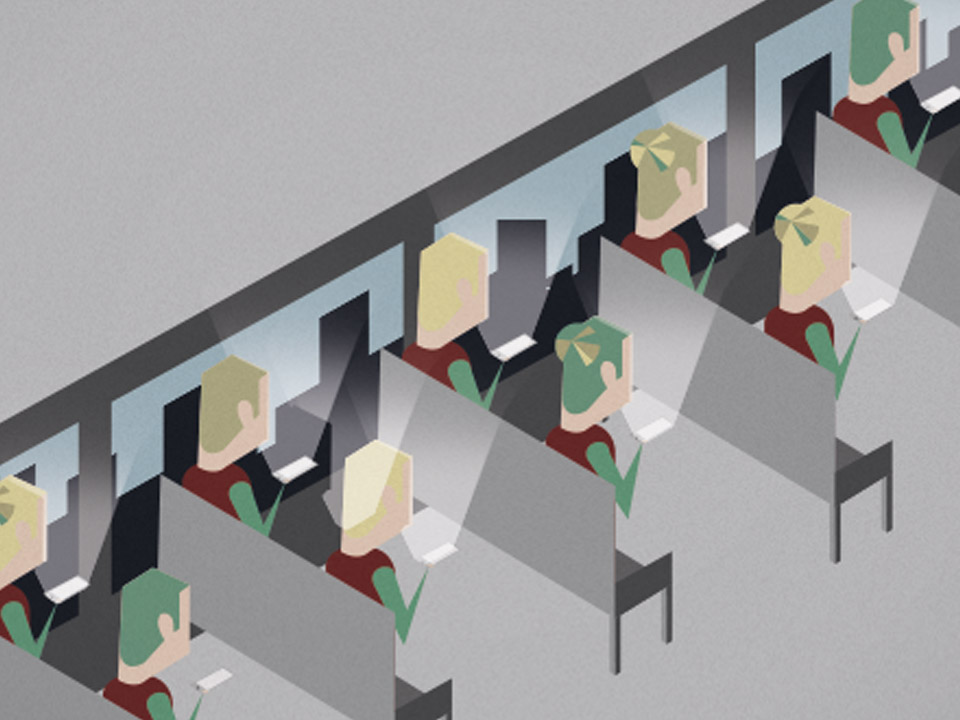
Scene two accompanies the fact that a huge percentage of video is now consumed on mobile devices. This is the image at the top of this post. Scene three shows how consumers of traditional television are an aging demographic.

