McDaniels Law are a North East law firm specialising in intellectual property protection. Working with creatives and entrepreneurs from all industries, McDaniels Law understands and appreciates exactly what it took for their clients to get to where they are today. They are detail focused, not only in their own practice, but in their clients also. Protecting every single detail of each and every clients intellectual property is McDaniels mission and an idea that sits at the core of their visual identity, their tone of voice and every single thing they do.
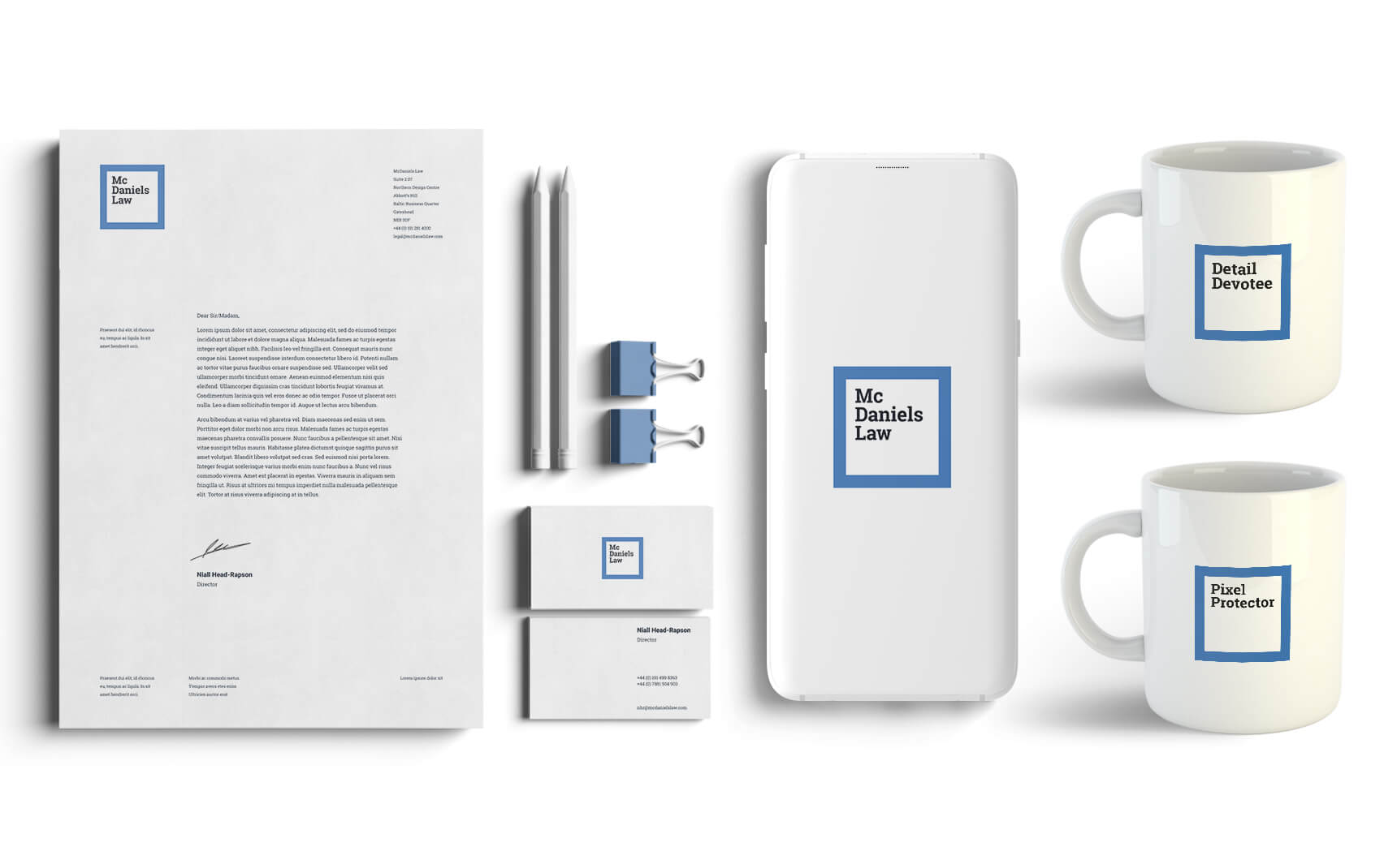
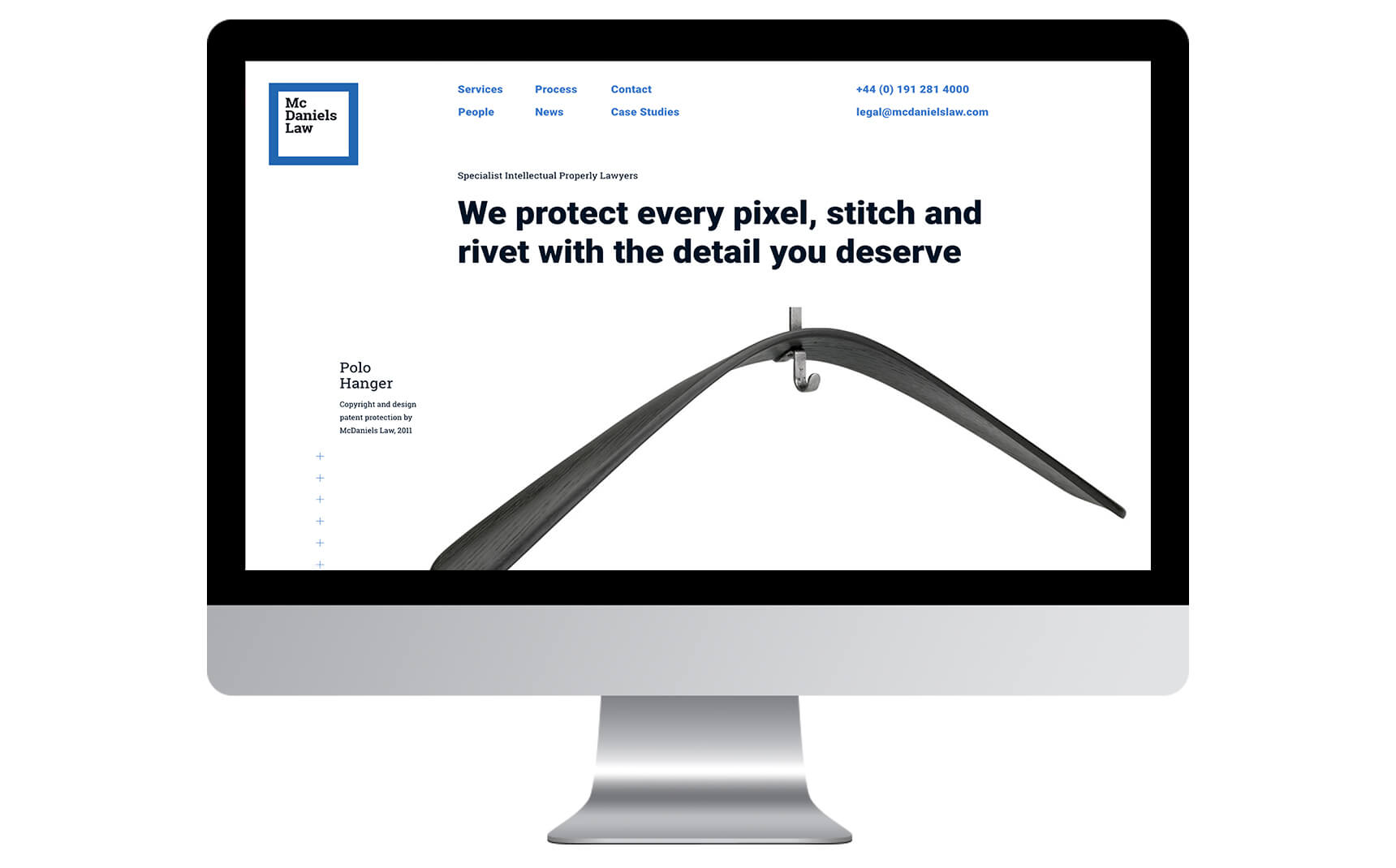
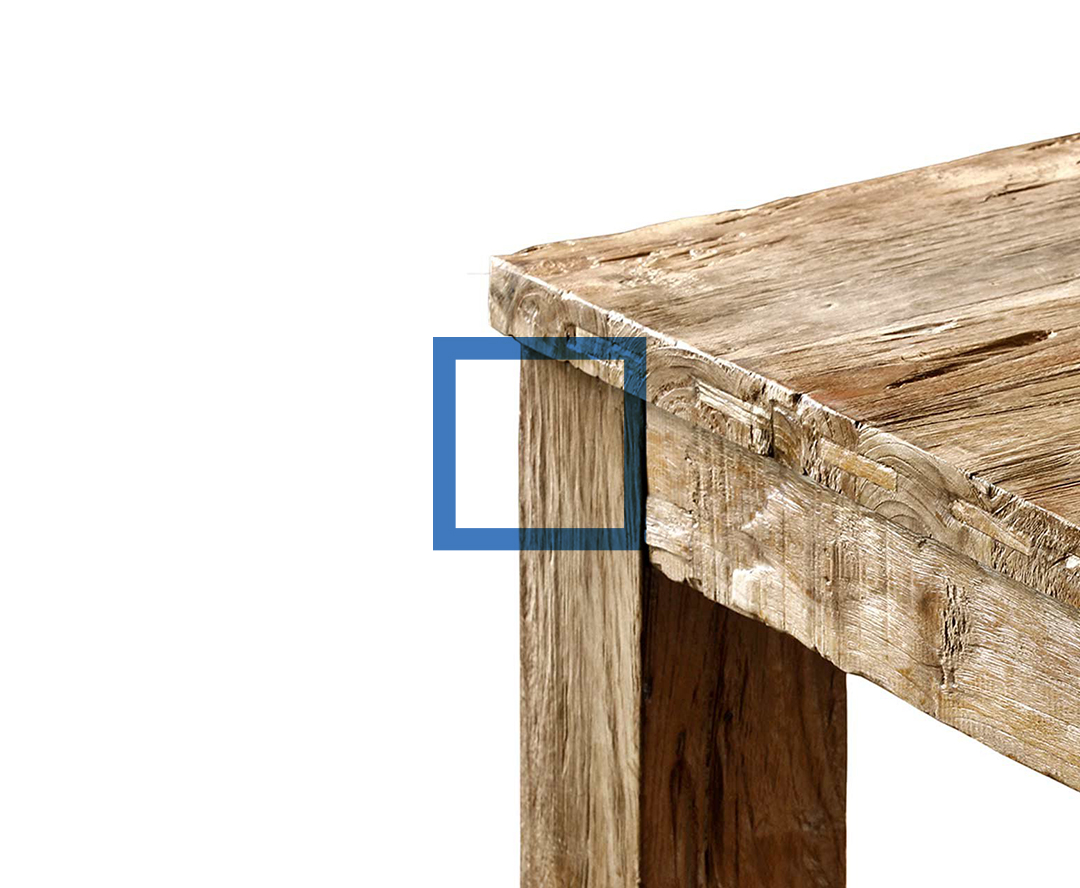
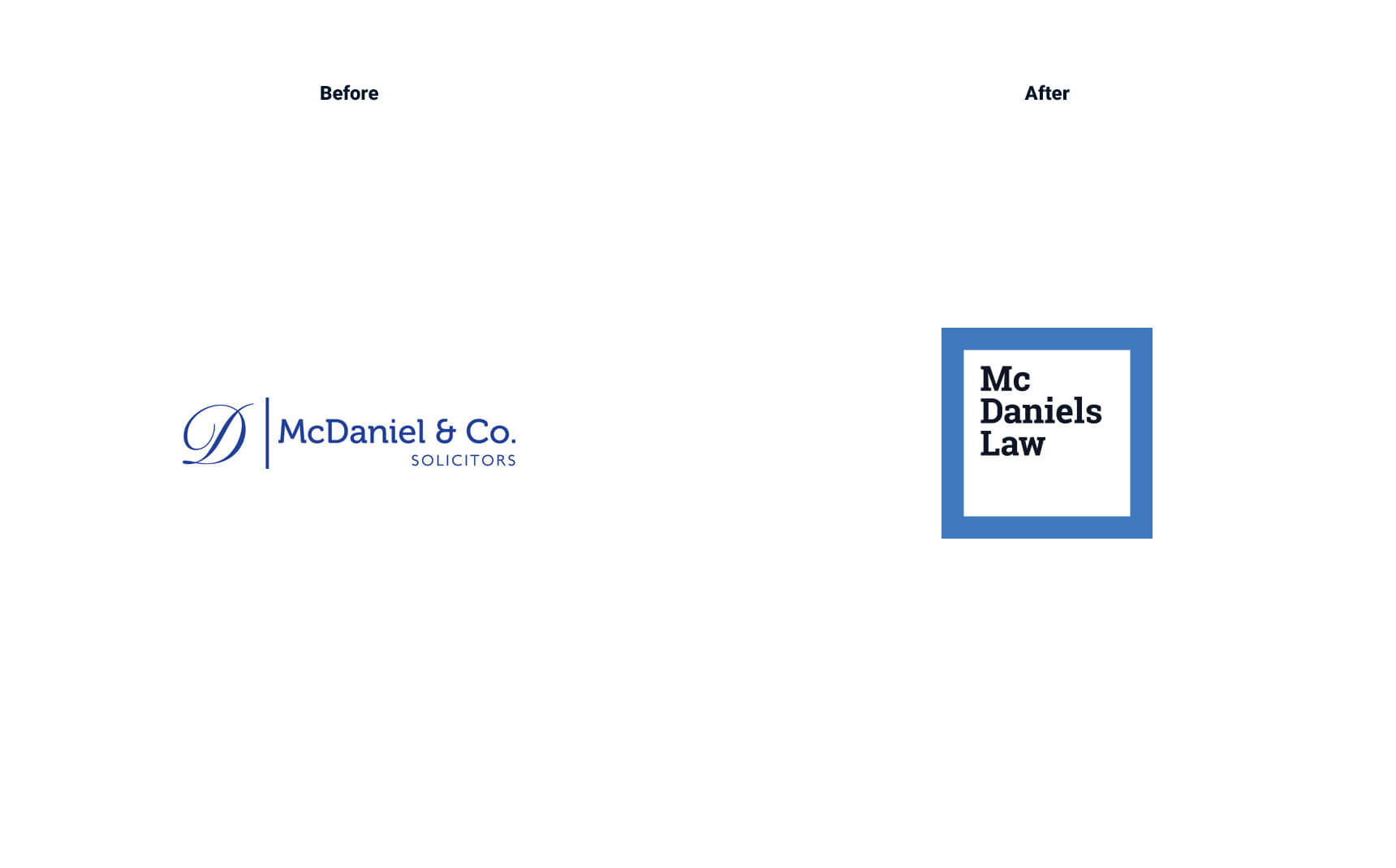
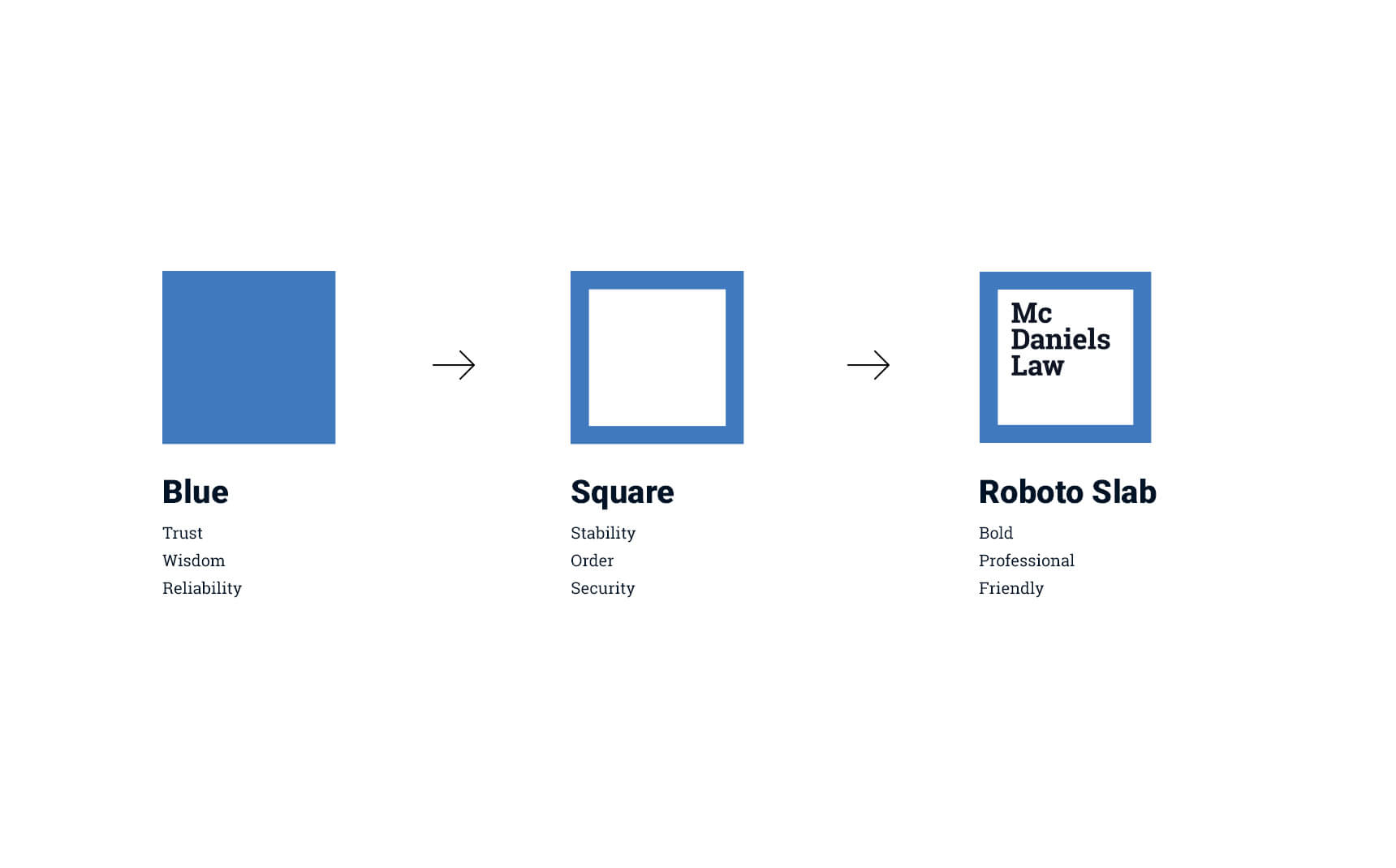
The logo was redesigned to be bold, clean, concise and instantly recognisable. The logotype is wrapped in a heavy blue outline that symbolises trust, solidarity and security, while doubling up as a frame/viewfinder when paired with detail images of their clients products.
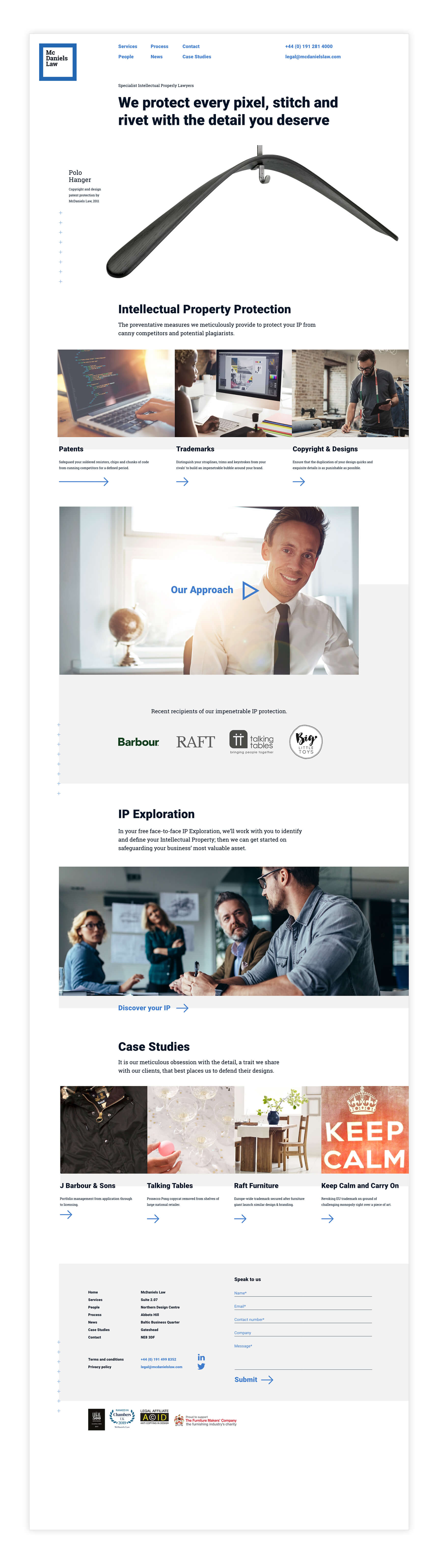
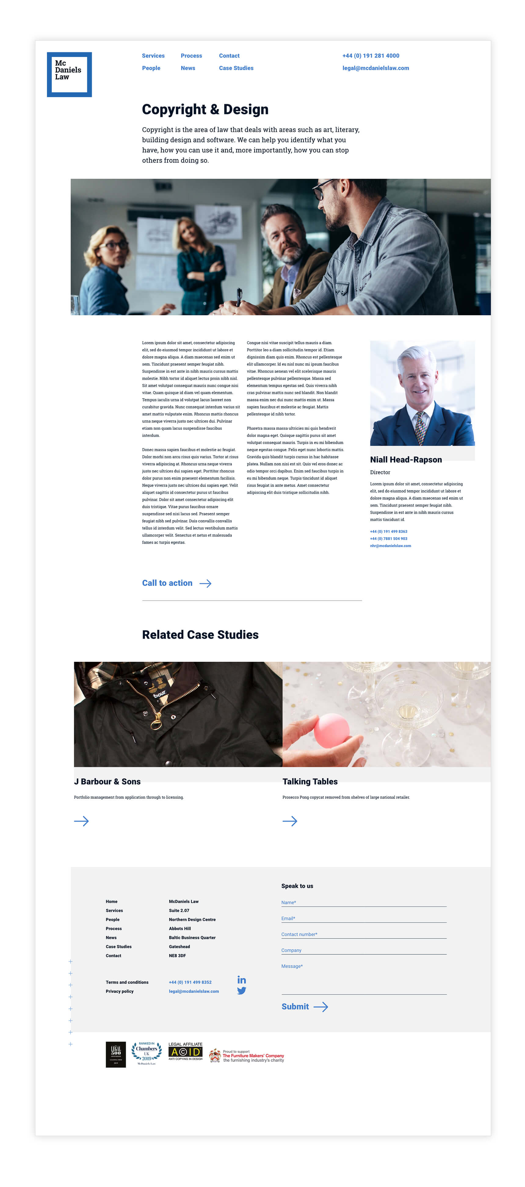
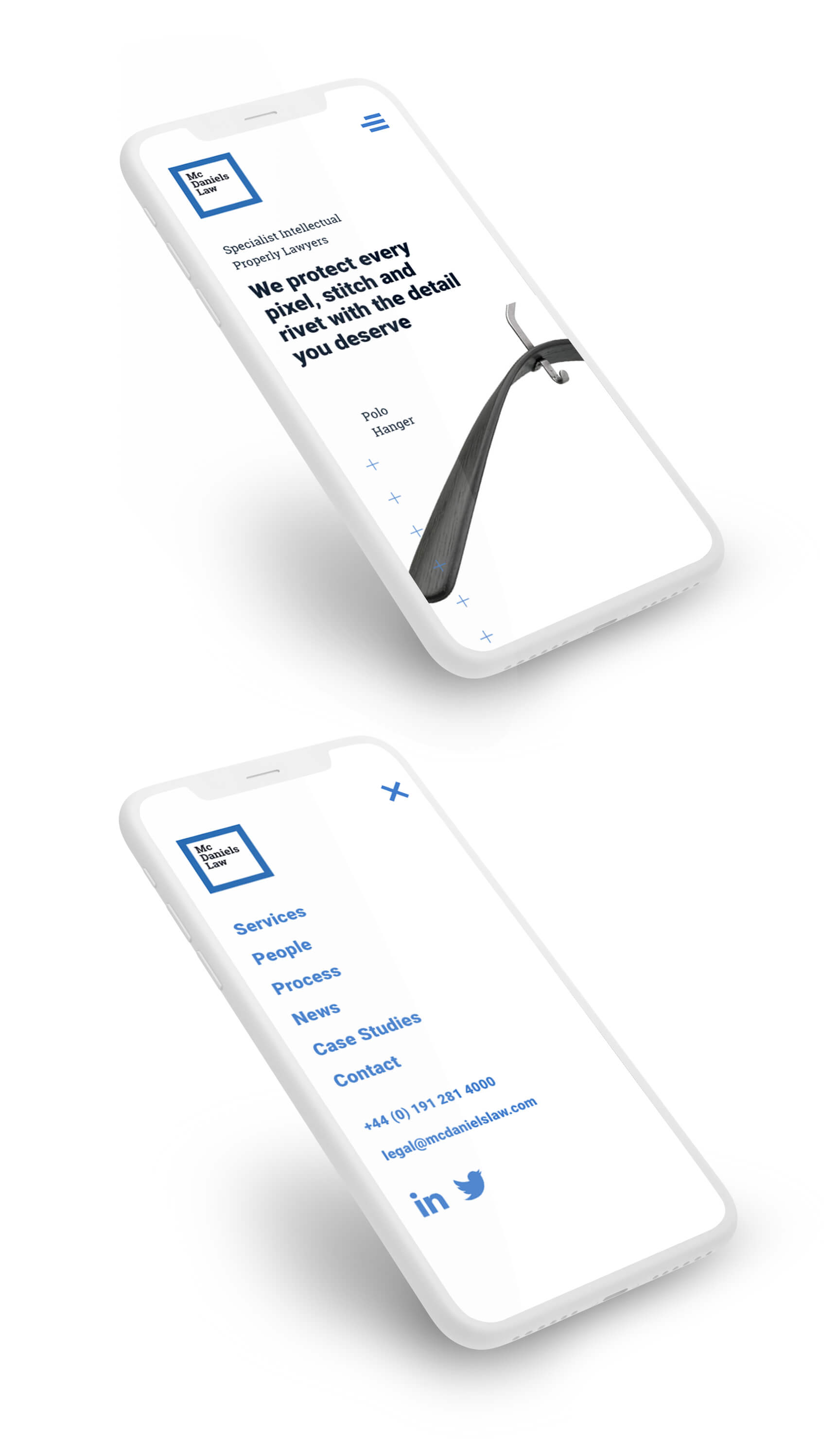
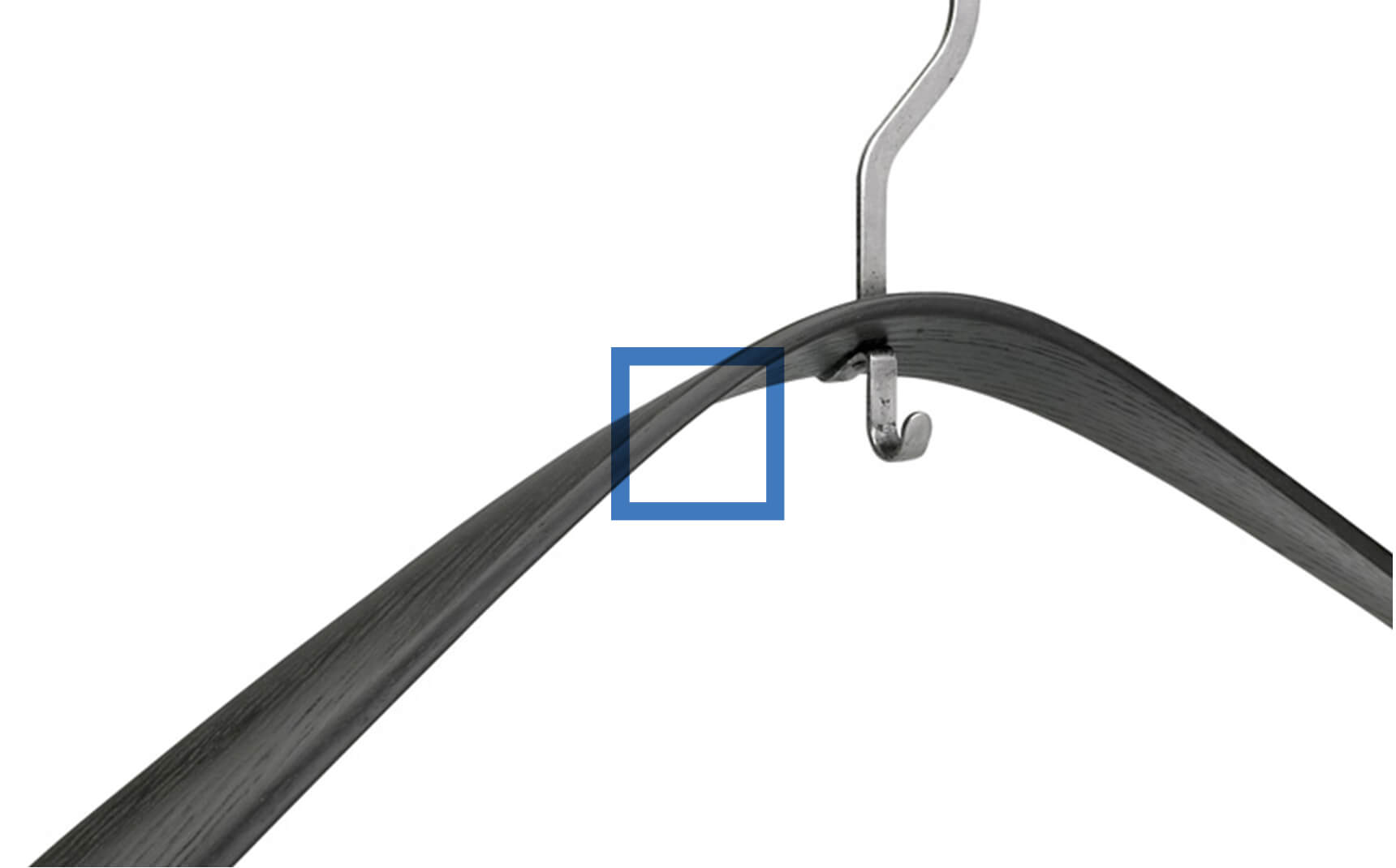
The website followed this style with an abundance of white space, large headlines contrasting with smaller body copy and bold imagery that on first glance, is not instantly recognisable. McDaniels’ attention to detail is the pillar that their visual identity, featured imagery, messaging and typography all anchor to.

Brand Message
Our dedication to your design, our commitment to your concept, our passion for your product. They’re matched only by your own.
At McDaniels, we’re devotees of detail. We pore over every pixel, stitch and rivet. We revel in every chamfer, keystroke, strapline, trim and line break. We make a note of every soldered resistor, chiselled groove and chunk of code. All this, to provide you with impenetrable Intellectual Property protection.

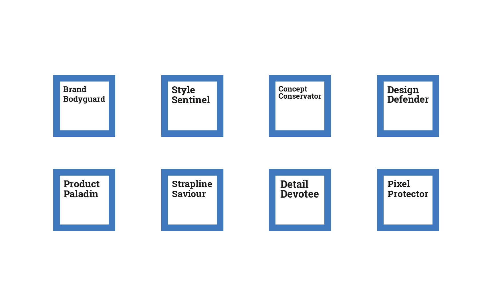
McDaniels Law have specialist attorneys in all industries, with some becoming the accidental superstars for certain areas such as gardening. With this in mind, I decided to create a playful range of personas, swapping out the brands logotype with titles like Brand Bodyguard and Detail Devotee. These can then be applied to any brand collateral as conversation starters.